
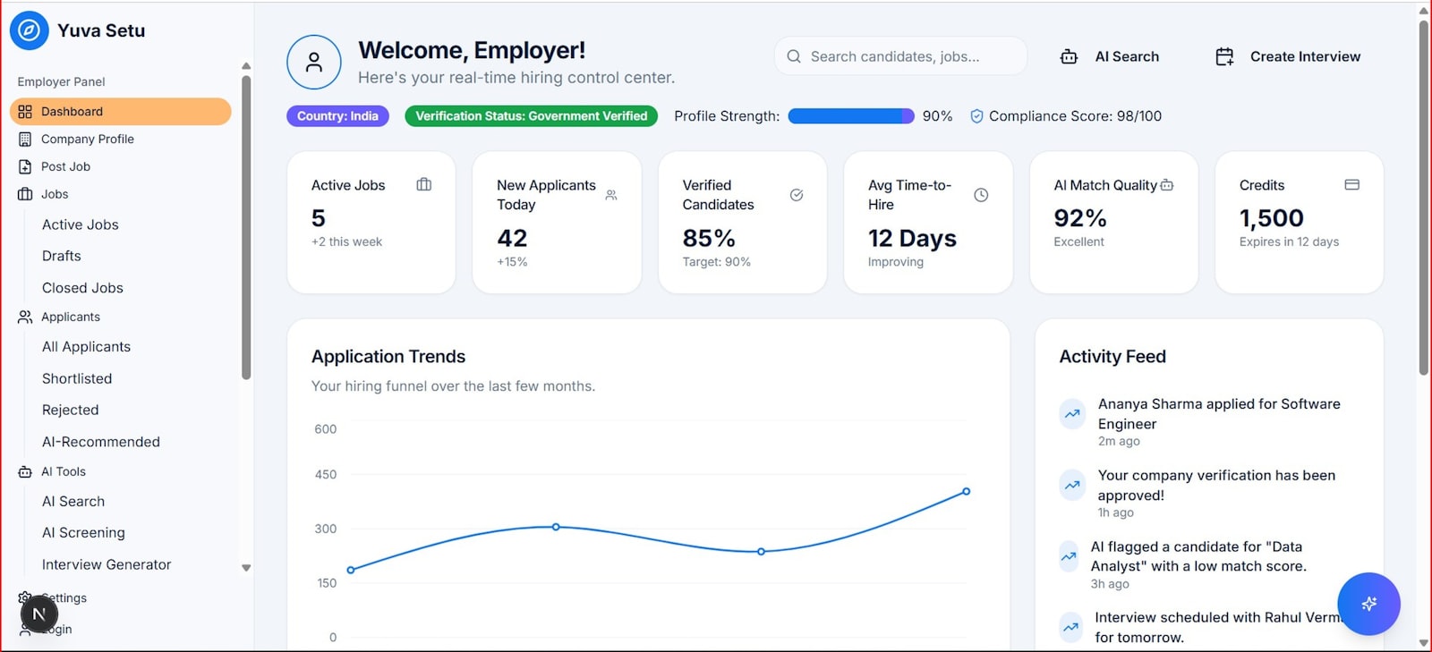
A Brisbane wholesale business we reviewed recently had a dashboard. A proper one. Forty-odd charts across six tabs, connected to the accounting file and the inventory system, built about eighteen months earlier at real cost. The owner opened it in front of us, and the screen took a moment to load because nobody had opened it since the previous quarter. He knew his numbers, roughly. He just got them from his bookkeeper, verbally, once a month.
That’s not unusual. In our experience it’s the default. The dashboard gets built with genuine enthusiasm, gets checked daily for a fortnight, then weekly, then never. So let’s deal with the myth that keeps producing this outcome.
The myth: if you can see all your data, you’ll make better decisions
More visible data does not lead to better decisions. It usually leads to no decisions, because a screen with forty metrics doesn’t tell you what to do next, it just tells you that lots of things are happening. The owner glances at it, feels vaguely informed and vaguely anxious, closes the tab, and goes back to running the business the way they always have.
The myth survives because it sounds reasonable. Data is good, so surely more data is better. But a dashboard isn’t a data storage exercise. It’s a decision-making tool, and decisions need a small number of inputs, a clear threshold for action, and a regular moment when someone actually looks.
A business dashboard not used weekly is a sunk cost wearing a nice interface.
Why does a business dashboard end up unused?
A business dashboard gets abandoned for one of four reasons: it shows too many metrics, it answers no specific question, nobody owns it, or the data underneath it stopped being trusted. Every abandoned dashboard we’ve been shown fails on at least two of these.
Walk through them honestly against your own reporting.
Too many metrics. If the dashboard tries to show everything, it prioritises nothing. The owner can’t tell at a glance whether the week was good or bad, so the glance stops happening.
No question behind it. A chart of revenue by month is a fact, not an answer. Compare that with ‘do we have enough cash to cover the next two payroll runs’. One of those gets opened on a Monday morning. The other doesn’t.
No owner. If the dashboard belongs to everyone, it belongs to no one. Nobody updates it, nobody notices when a data feed breaks, and nobody is expected to act on what it says.
Broken trust. The first time an owner spots a number they know is wrong, the whole dashboard dies. They may keep opening it for a few weeks out of habit, but they’ve stopped believing it, and belief doesn’t come back cheap.
Here’s the first-hand version of that last point. When we sit in on management meetings, the moment someone says ‘yeah, that figure’s not quite right, the real one is…’ and quotes from memory or a spreadsheet, the dashboard is finished. It might stay on the wall for another year. It’s still finished.
What a dashboard needs to earn a weekly look
A dashboard gets used weekly when it answers a specific question, fits on one screen, has a named owner, and is tied to a recurring meeting where someone has to act on it. Miss any of those and usage decays to zero within a quarter or two.
The question part matters most. Good dashboards start from decisions, not data. Which jobs are running over budget this week? Is our pipeline big enough to hit next quarter? Which customers are more than 30 days overdue? Pick the three to five questions that actually change what you do on a Monday, then build backwards from there.
One screen, no scrolling. If a number matters enough to act on, it fits above the fold. Everything else can live in a detailed report that gets pulled when someone needs to dig.
And the meeting is the trick almost everyone skips. A dashboard with no ritual attached is a poster. Put it first on the agenda of a 20-minute weekly meeting, make one person responsible for walking through it, and it becomes infrastructure. In our experience the meeting keeps the dashboard alive far more than the dashboard improves the meeting, at least for the first few months.
| Attribute | Abandoned dashboard | Dashboard that gets used |
|---|---|---|
| Metric count | 30 to 50 | 5 to 9 |
| Built around | Available data | Specific decisions |
| Owner | Nobody in particular | One named person |
| Review rhythm | ‘Whenever’ | Fixed weekly slot |
| Reaction to bad data | Quietly ignored | Fixed within the week |
How many numbers should actually be on it?
Five to nine numbers is enough for a weekly business dashboard, and each one should have a target or threshold next to it so a glance tells you whether action is needed. Cash position, sales pipeline, a delivery or capacity measure, gross margin, and overdue debtors covers most small businesses. Add one or two that are specific to your model, then stop.
Here’s the discipline test we use with owners. For each metric, finish this sentence: ‘If this number goes the wrong way, we will…’ If you can’t finish it, the metric is decoration. Cut it.
A quick sanity check on cost, using round numbers. Say a dashboard build costs $6,000 and someone spends two hours a week maintaining it at $75 an hour. That’s $150 a week, or roughly $7,800 a year in maintenance on top of the build. If the thing gets opened four times a year, you’ve paid five figures for four glances. If it drives one decision a week, catching a margin slide a month early or chasing an overdue debtor two weeks sooner, the maths flips fast. Same tool. The difference is entirely usage.
The tool matters far less than owners think
The choice of software is the least important decision in the whole exercise. We’ve seen a shared spreadsheet, updated by hand every Friday afternoon, outperform a fully automated BI platform, because the spreadsheet was opened every Monday and the platform wasn’t. A pattern we keep seeing: businesses switch tools to fix a usage problem, and eight months later they have a newer unused dashboard.
That’s not an argument against proper tooling. Automated feeds beat manual entry once the habit exists, because manual entry is where data trust quietly erodes. The order matters though. Habit first, then automation. Get the weekly meeting running off a rough spreadsheet for two months. Once nobody would dream of cancelling that meeting, invest in plumbing.
Common questions about dashboards that don’t get used
Are dashboards becoming obsolete?
No. Static, everything-on-one-wall dashboards are fading, and AI tools now let people ask questions of their data directly, but the underlying need has not changed. A small set of trusted numbers, reviewed on a fixed rhythm by someone accountable, still beats ad hoc queries for actually running a business week to week.
What is the 5 second rule for dashboards?
The 5 second rule says a viewer should find the most important information on a dashboard within about five seconds of opening it. If an owner has to hunt, filter or scroll to work out whether the week was good or bad, the design has failed and usage will drop off.
What are the 4 types of dashboards?
The usual four are strategic (long-term goals for leadership), operational (daily and weekly running numbers), analytical (deep exploration of trends) and tactical (tracking progress on specific projects). Most small business owners only need one operational dashboard, and trying to build all four at once is a common reason none of them survive.
What is the primary purpose of a business dashboard?
A business dashboard exists to trigger decisions faster than waiting for monthly reports. It puts a small set of current numbers next to their targets so the owner can spot a problem this week instead of discovering it in the accounts next month.
Should I build my dashboard in a spreadsheet or a BI tool?
Start with a spreadsheet if you don’t yet have a weekly review habit, because habit is the failure point, not software. Move to an automated tool once the review is locked in and manual updates are becoming the bottleneck or a source of errors.
How often should a business owner check their dashboard?
Weekly, at a fixed time, tied to a short meeting where someone is expected to act on what it shows. Daily checking suits high-transaction businesses like hospitality or ecommerce, but for most trades, professional services and wholesale operations, a disciplined weekly review beats a sporadic daily glance.
My dashboard shows a number I know is wrong. What do I do?
Fix it within the week or remove the metric entirely, because one visibly wrong number destroys trust in every other number on the screen. Trace the feed back to the source, and if the data can’t be made reliable, a smaller dashboard you believe is worth more than a bigger one you don’t.
Start with the five numbers, not the software
If you’ve got a dashboard gathering dust, don’t rebuild it yet. Write down the five questions that would change what you do next Monday, and check whether your current reporting answers any of them. That exercise takes half an hour and usually explains exactly why the old one died.
If you’d like a second pair of eyes on it, our operations team spends a lot of time turning abandoned reporting into a weekly rhythm that owners actually keep. A first conversation costs nothing and you’ll leave with a clearer view of which numbers deserve the screen space.